While you’ll certainly want to monitor how many website visitors you get each month, perhaps a more important metric is your conversion rate, as this will show you whether those visitors are actually becoming customers. You want to keep the number of people leaving your website without spending money with you as low as possible.
In this guide, we are going to be looking at some quick and simple ways to help you increase sales and improve your website’s conversion rate. Read on to learn more.
Make sure every page of your site has a strong call to action
Call to actions (CTAs) are prompts that tell visitors what to do when they get to your website. They’re an important part of your site because they guide people towards a conversion.
To write and create a strong call to action, make sure you use command verbs and words that tell people to do something. CTAs like “Buy Now”, “Sign Up”, and “Subscribe” are very good examples. Also, try to use bright and bold colours for your CTA buttons so they will stand out against the rest of your site.
For inspiration, here are some examples of sites that have put a lot of thought into creating strong CTAs.
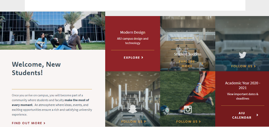
For instance, American International University uses a range of CTAs at the bottom of its careers center page to encourage visitors to execute certain actions.
They have a section where you can learn more about the opportunities the university offers and other CTAs encouraging people to follow them on their socials. This is a great way to cater to people who are at different stages of their journey with the school and it will make sure that people are taking at least one action on the page before leaving their website.
Regardless of the type of business you run, doing something similar and providing different CTAs for different people could help you to secure a lot more conversions.
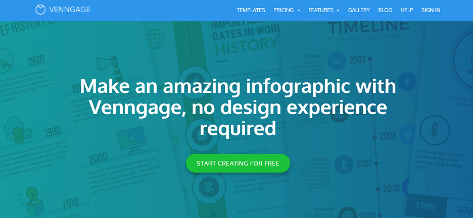
We also have an example from Venngage, an online infographic maker. On their service page, they make use of a bright and bold green CTA button that contrasts against the blue of the page’s background. This immediately attracts the attention of new visitors and directs them towards getting started.
And, if you look at the words used in the CTA, you’ll see that they tell people to start using their tool for free. This is a great way to convert people who might not be ready to make a financial commitment, and it can increase their number of sign-ups. Also, they include this CTA at different sections of the page so it’s impossible to miss, even when visitors start to scroll down.
If you have a free version or trial period for your product, you can emulate this by using your CTA to let people know about your free offering. Also, you should try to position CTAs at various points on your web page so people don’t miss them as they scroll by.
Showcase customer reviews to earn website visitors’ trust
People tend to trust word-of-mouth recommendations over marketing, so it’s a good idea to ask your customers for reviews and testimonials you can publish on your website. These will show that you’ve done a great job for your customers in the past and will build a sense of trust with new clients.
To ask your customers for testimonials, try to make the process as easy as possible for them. You could simply send a survey form and ask them to rate your business or provide a comment about your services. If you want some more information on ways to get more online reviews, SalesPOP has a great guide on doing this in a way that will help you build customer trust.
When you get these reviews, make sure you are displaying them effectively on your site. You could create a section on your home page and include various reviews in a sliding carousel or even arrange the reviews on banners across your site. Alternatively, you could create an entire webpage for reviews so prospects can see the great testimonials you’ve gotten from past customers in one place.
Now, let’s take a look at some of the different ways certain businesses are already showcasing reviews on their sites. This should give you plenty of inspiration.
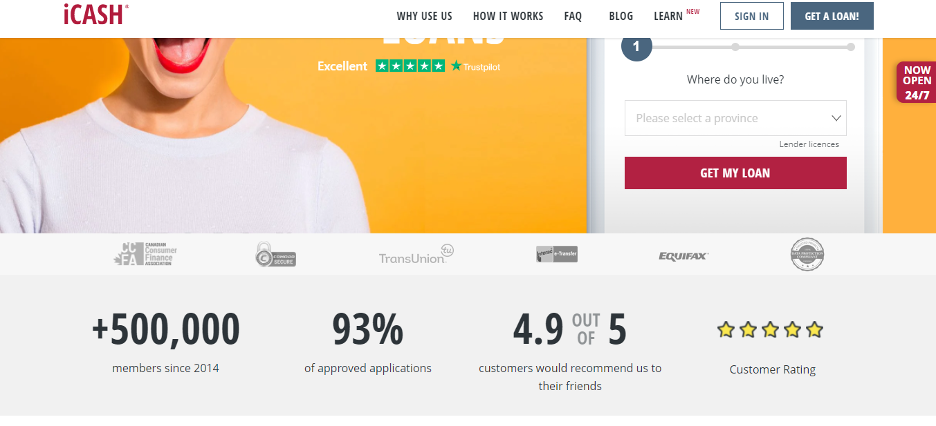
For instance, iCASH is a financial lending company and, on their payday loans page, website visitors can find relevant testimonials that show how trustworthy the company is.
They display an overall 5-star customer rating and also let people know that 4.9 out of 5 customers say they would recommend iCASH to their friends. These kinds of ratings, coupled with the fact that they have more than 500,000 members and 93% of their applications get approved, do a great job of making sure that new website visitors will trust the company to deliver an excellent service. Then, naturally, this will lead to more sales for the business.
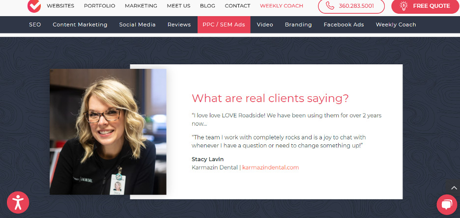
On the other hand, Roadside Dental Marketing has chosen to display longer testimonials on their web page about PPC advertising for dentists.
Looking at their page, you can see that this review is very positive and it tells prospective customers how glad the client is to be working with this company. This is a great way to make future customers trust their brand and it also plays a very important part in convincing prospects to convert into customers.
Client testimonials are a vital element of your website and they can help you get more customers for your business. When displaying reviews, make sure you include the name, company, and website of your clients if possible, as this helps to show the authenticity of the testimonials.
Choose imagery that will help people feel connected to your business
Nowadays, more companies are realizing the need to look for ways to connect to people in a virtual world. This is because people who feel connected to your business are far more likely to spend money with you.
One of the most effective tools for ensuring this is your website imagery, and there are a number of ways you can use your website images to help your target audience feel a stronger connection with you. For instance, you could add imagery of your staff to humanize your business or feature people who represent your target audience on your product or service pages. You could also use product photos that show how you can help people with their pain points.
To give you a practical example, here’s a website that currently uses photos to create a connection with its customers.
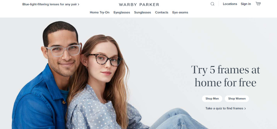
Warby Parker is an excellent example to use for this. When you land on their website, you are met with the image of two people wearing glasses frames. As a company that sells eyeglasses, using images of various models wearing these glasses can make prospective customers feel a connection with the brand because they are seeing people just like them using the products they want to buy.
As we mentioned earlier, using people to model your products might not work for all businesses. But, if your company offers clothing items or accessories that can be worn, then you should be using real models for your product images. Avoid using stock photos or mannequins, and use images of real people who your audience can relate to.
Focus on highlighting the benefits of your products or services
In the rapidly evolving world of e-commerce and online marketing, personalizing user experiences on your website can dramatically enhance conversion rates. Platforms like Intellimize streamline the process by leveraging AI to customize content, offers, and CTAs based on real-time user behavior and historical data. This ensures each visitor enjoys a tailored browsing experience, significantly boosting engagement and conversions.
The copy on your website — and how you structure it — can have a huge impact on your conversion rate. One important tip for writing sales copy that converts is to highlight the benefits of your products or services before anything else, like the price or features.
Some of the benefits you can highlight are that your product will save people time or that your service will give customers great results. You can also let visitors know that your business can make or save them money.
Here are some businesses that use this tactic of highlighting benefits first, so you can get some inspiration.
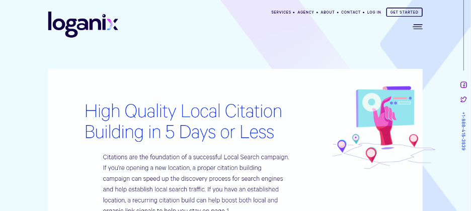
Let’s study Loganix’s local citation building web page, for example. On the page, before visitors even get a chance to scroll down, we’ve already highlighted the benefits that people can get from using our service. And we do this by making it known to customers that they can get high-quality citations in 5 days or less.
By doing this, we get people to start thinking about how beneficial it would be to get such fast results. And website visitors will see this information before they even think about the price or what the service actually entails. They’ll be sold straight away.
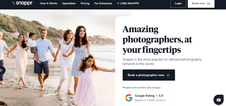
Another example is from Snappr, a website where people can book photographers on-demand. At first sight, the headline copy on their homepage tells you the benefit you get from the site: amazing photographers at your fingertips.
For people who might have been searching for quality photographers for a while, seeing this kind of copy would spur them on to click the CTA button and find a photographer that they can use. So, highlighting the benefits like this is a great way to encourage more sign-ups and conversions for the site.
If you also want to use this practice of highlighting the benefits of your products or services first, try to ensure that you don’t use too many words or sentences to do this. Keep things concise and, if possible, limit the copy to 2-3 lines so it’s brief enough to catch people’s attention but still passes the message across.
Make it as easy as possible to find your contact details
If prospective customers have a question or concern about your products or services, they’ll want to get in touch with you. And, If it’s difficult to do this, they’ll most likely leave without making a purchase. So, you should be providing several contact options for customers like email, phone, or a live messaging service so they can reach a representative of your company when they need to.
In order to provide customer service that will grow your sales, don’t forget to train your customer service team on the best ways to handle questions and complaints from prospective customers. This is very important because, if any of your customer service personnel treat a customer badly, it could affect your entire brand.
Also, when displaying contact options on your website, you should try to make them as obvious as possible. You could use intuitive icons like a phone ringing or a message icon to indicate the contact options or even create a separate contact web page and highlight this in your menu and footer.
Let’s take a look at an example of a company that does a great job of offering lots of contact options and highlighting them on their website.
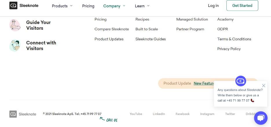
Sleeknote is a company that provides lead generation software and, on their website, they do a great job of ensuring customers can easily find different ways to contact them. Aside from the fact that they have a contact page linked in their header and footer area, they also make use of an arrow to show people the phone number to call if they ever have any questions.
Also, they’ve implemented a live chat feature that is quite noticeable with its bright blue icon by the far right of their page. Using these types of design techniques is a good way to call visitors’ attention to the available contact options so they can get in touch with a company representative.
This is something that you can implement for your website, and you can even go one step further by including contact options on the side banners of your site. This will make them harder to miss and will ensure that people don’t leave your site without seeing the options they have to contact you.
Summary
As a business owner, website conversion rates are one of the metrics that should be on your list of key performance indicators (KPIs). But it doesn’t have to take you years to see an improvement in your conversion rates.
By using strong CTAs, displaying customer reviews, and highlighting the benefits of your products and services, you’ll be able to optimize your website in ways that will increase your conversion rate significantly. To see other effective techniques for improving your business, take a look at Sales POP!’s marketing archives of valuable content.


Comments