When you’re running an ecommerce business, it can be easy to get caught up in metrics, conversions, and the latest digital marketing trends. But at the end of the day, the key to sustainable online success is something a bit more straightforward: putting your customers first.
This may not sound groundbreaking, but the truth is that too many online retailers still aren’t prioritizing the user experience enough. That’s a big mistake, because customer-centric companies tend to see nearly double the revenue growth of businesses that don’t focus on their audience’s needs.
That’s why, in this article, we’ll break down how a user-centric design approach can help your ecommerce business thrive in the long run. You’ll get practical tips to create a truly user-focused ecommerce experience.
By the end, you’ll have a solid game plan for designing an online store that keeps customers coming back again and again.
Enable Intuitive Product Comparisons
When shoppers can easily compare items, they’re more likely to find exactly what they need, leading to higher satisfaction and fewer returns.
Product collection pages are the perfect spot for this feature. Think about it – when customers land on a category page, they’re often weighing their options. By making comparisons simple and visual, you’re saving them time and reducing frustration.
How to Achieve It
- Standardize your product photos. Use consistent backgrounds, lighting, and angles across your inventory. This creates a level playing field for comparison.
- Add an extra angle view that appears when customers hover over an image. This gives shoppers a better feel for the product without cluttering the page.
- Offer custom views directly from the collection page. Let users see different color options for a product without navigating away. This small touch can significantly enhance the browsing experience and make it easier for customers to find what they want.
Example
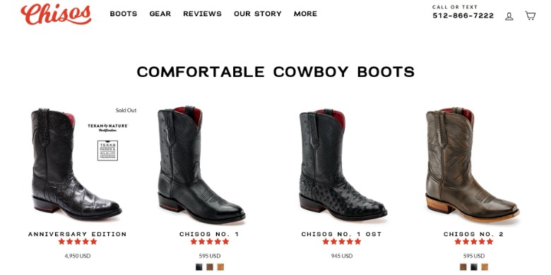
A brand that’s crushing it with intuitive product comparisons is Chisos, a cowboy boot company. Their Comfortable Cowboy Boots collection page is a masterclass in user-friendly design. There, all their boots are displayed in a neat, uniform grid.
Each product image shows the same angle, with a consistent hover effect that reveals an additional view. This way, shoppers can switch between color options right on the collection page, with the product image updating in real time.
This approach makes it incredibly easy for Chisos’ customers to browse and compare their range of products. It’s a perfect example of how user-centric design can simplify the shopping process and enhance the overall customer experience.
By implementing similar tactics, you can make your ecommerce site more intuitive and shopper-friendly.
Provide Multiple Product Browsing Categories
People shop for all sorts of reasons – some know exactly what they want, while others are just browsing. Some shop by brand, others by price, and some by specific features or benefits.
Offering various ways to explore your products on your ecommerce site caters to these varying needs and makes it easier for customers to find what they’re looking for.
When users can browse by their specific criteria, they’re more likely to find products that match their preferences, leading to higher satisfaction and, ultimately, more sales.
How to Achieve It
- Get to know your audience. What are their pain points? What matters most to them when shopping for your products?
- Use this insight to create a navigation structure that addresses these different needs and preferences.
- Consider categories like:
- Brand
- Price range
- Specific features or benefits
- Popularity or best-sellers
- Customer ratings
- Don’t stop at just one or two options. The more ways you give customers to browse, the more likely they are to find something that clicks with their shopping style.
Example
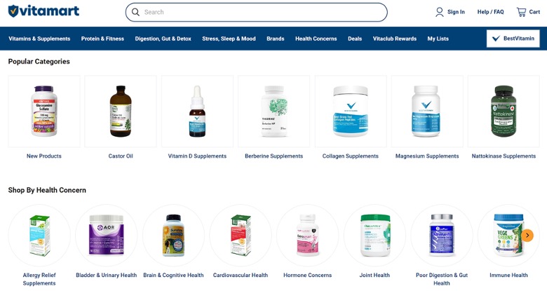
A great example of this is Vitamart, a Canadian vitamins & supplements ecommerce store. Their homepage is a testament to user-friendly design, offering multiple “shop by” options that cater to different customer needs.
You can browse by health concerns, which is perfect for shoppers looking to address specific issues. There’s also a popularity category for those who trust the wisdom of the crowd.
They even have a category for how the product is ingested, like chewable options, which is great for customers with specific preferences or needs.
This approach improves the user experience and increases the chances of customers finding products that truly meet their needs.
Ensure Product Customization UX is Intuitive
Product customization is a great way to give customers exactly what they want, but it’s essential to make the process smooth and intuitive.
73% of consumers will jump ship to a competitor after a few bad experiences. That’s why nailing your customization UX is so important – it can be the difference between a loyal customer and a lost sale.
How to Achieve It
- Organize your customization fields smartly. Group related options together and present them in a logical order.
- Make pricing crystal clear by showing a running total as customers select each option. This transparency helps prevent sticker shock at checkout.
- Ditch unnecessary clicks. Instead of forcing customers to open dropdown menus for every choice, consider using visual selectors or radio buttons where it makes sense. The goal is to make the customization process feel effortless, not like a chore.
Example
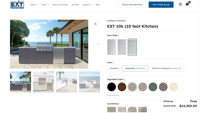
EXT Cabinets, an outdoor kitchen and cabinet company, knocks it out of the park with customization UX on their EXT 10k Outdoor Kitchen product page.
When you’re choosing a door style, you’re not faced with a boring list of names. Instead, you see simple visuals of what each door option looks like. The same goes for other elements like countertops, colors, and hardware. It’s all laid out visually, making it easy to imagine how your choices will look in real life.
Additionally, whenever an option comes with an extra cost, it’s clearly marked. The final price updates automatically as you make selections, so there are no surprises at checkout.
This level of transparency and visual clarity makes customizing a complex product like an outdoor kitchen feel almost as easy as ordering a pizza online.
Welcome a High-Touch Sales Process
It’s easy to forget the power of human connection in today’s digital age. But, it seems that people are still willing to put in extra effort just for a more personal touch. In fact, 85% of customers would replace a company with another one that offers better customer service.
Having a high-touch approach means prioritizing personal interactions with your customers. It’s about being there, ready to help, whenever they need you.
This strategy works wonders for complex products, big-ticket items, or when your clientele might need extra guidance.
How to Achieve It
- Make your contact information front and center on your website.
- Don’t hide your phone number in the footer – put it where it’s easy to spot.
- Consider adding a live chat feature for quick questions.
- Train your staff to be knowledgeable and patient, ready to guide customers through their buying journey.
- The goal isn’t to be pushy but to be available. Make it clear that you’re there to help, not to hard-sell.
Example
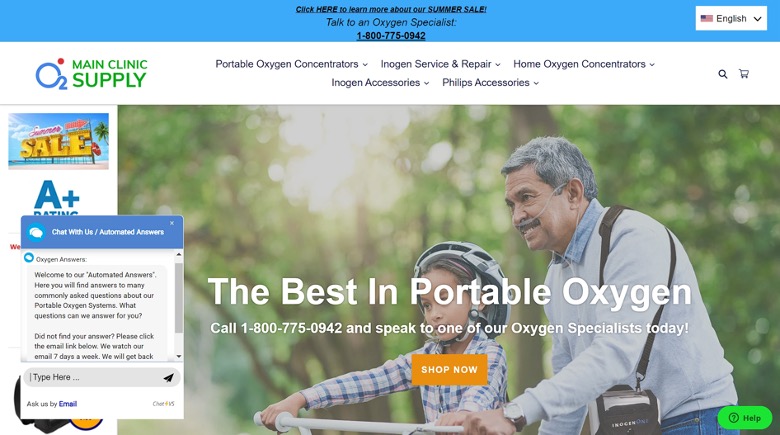
Main Clinic Supply, a portable oxygen equipment ecommerce store, designed their website with their customers in mind – many of whom are elderly and might be less comfortable with online shopping.
As soon as you land on their site, a contact popup appears, making it easy to reach out for help. They also display their phone number prominently in the header.
This setup is perfect for their audience, who might prefer talking to a real person when shopping for expensive, potentially life-saving equipment.
This is a great example of how a high-touch approach can enhance the user experience and build customer loyalty. By prioritizing easy communication, you can show that you understand your customers’ needs.
Don’t Force Users to Visit Product Pages to See Social Proof
The number of reviews a business has is vital for 60% of consumers when deciding whether to use its services. So, it doesn’t make much sense to hide this valuable info deep in your site.
Showing social proof early and often is a smart, user-centric move. It builds trust quickly and helps shoppers make decisions faster.
By displaying ratings and reviews right on your homepage or category pages, you’re giving customers the confidence they need to move forward with a purchase.
How to Achieve It
- Showcase star ratings on your homepage and product category pages.
- Don’t make shoppers click through to individual product pages just to see what others think.
- Consider adding a badge that shows your overall rating and the total number of reviews you’ve received. This gives a quick snapshot of your reputation.
- For product listings, include the star rating and number of reviews right below each item. This lets shoppers compare products not just by features or price but also by customer satisfaction.
Example
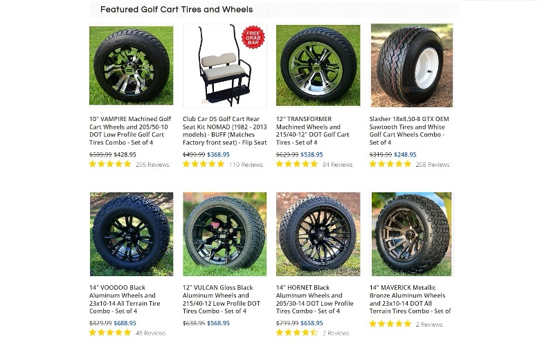
Golf Cart Tire Supply, a seller of golf cart tires and accessories, has woven social proof into their site design beautifully.
Right in the header, they proudly display a badge showing their impressive 18,000 certified reviews and a 5-star rating.
But they don’t stop there. On their homepage, where they feature their products, each item comes with its own star rating and review count. This means shoppers can see at a glance which products are customer favorites. It’s great to be able to do this without having to click into individual pages.
This is a great example of how integrating social proof into your site design can enhance the user experience and boost confidence in your brand.
Enable Subscription Purchasing
Subscription purchasing taps into two things customers love – convenience and savings. In fact, about half of consumers say these are the top reasons they sign up for product or service subscriptions. It’s all about making life easier for your customers while helping them save a few bucks.
Subscription models work because they take the hassle out of repeat purchases. No more remembering to reorder or running out at inconvenient times. Plus, the cost savings can be a big draw. It’s a win-win for both you and your customers.
How to Achieve It
- Identify products that make sense for subscriptions. These are usually items that customers need to replenish regularly.
- Make sure your subscription offer is clear and compelling.
- Highlight the benefits like discounts, free shipping, or exclusive perks.
- Make it easy to sign up but also easy to modify or cancel. Nobody likes feeling trapped in a subscription.
- Consider offering flexible delivery schedules. Some customers might want monthly deliveries, while others prefer every two or three months. The key is to give customers control over their subscriptions.
Example
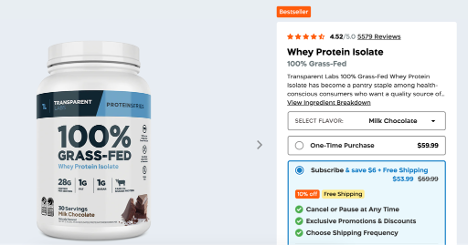
Transparent Labs, a natural sports nutrition supplement company, offers their 100% Grass Fed Whey Protein Isolate supplement on a subscription basis, and they’ve made the benefits crystal clear.
Subscribers get a 10% discount on the product price – a nice incentive to sign up. They also throw in free shipping, which can be a big draw for regular customers. And to sweeten the deal even further, subscribers get access to exclusive promotions.
It’s a smart approach that enhances the user experience while encouraging long-term relationships with customers. That’s what user-centric design is all about – making things easier and more rewarding for your shoppers.
Personalize Your Product Recommendations
Personalizing your product recommendations is a powerful way to enhance the shopping experience and boost sales. When customers see suggestions that align with their interests, they’re more likely to make a purchase.
Personalized recommendations show that you understand your customers’ needs and preferences, creating a more engaging and relevant shopping journey.
This strategy works because it taps into the psychology of shopping. When customers see items that feel tailored to them, they’re more likely to make a purchase.
How to Achieve It
- Collect data on your customers’ browsing and purchase history.
- Use this info to create algorithms that suggest relevant products.
- Consider factors like seasonality, current trends, and even local weather to make your recommendations even smarter.
- Make sure your recommended products are prominently displayed but not intrusive. Try adding a “You Might Also Like” section on product pages or a personalized “Just for You” category on your homepage.
- Keep in mind that the key is to keep learning from your customers’ behavior and refining your recommendations over time.
Example
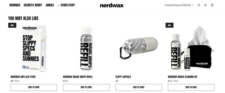
Nerdwax, a company that sells wax products for glasses, does this on their Nerdwax Magic Drops product page.
There, you’ll see a section with products that visitors might also like. These products are specifically chosen based on that visitor’s interests and other products they’ve been eyeing.
This approach shows that Nerdwax really gets their customers. They’re not just trying to sell more stuff but helping shoppers discover products that genuinely interest them.
By implementing personalized recommendations like Nerdwax, you’ll be able to improve your site’s user experience and show customers that you understand and value their unique preferences. That’s the kind of personal touch that keeps shoppers coming back for more.
Final Thoughts
As we wrap up, let’s zoom out for a second. User-centric design isn’t just about boosting sales or reducing bounce rates. It’s about respecting your customers’ time and energy.
Every improvement you make and every friction point you smooth out is a way of saying “We value you.”
So, what’s your next move? Maybe you should tweak your product pages or rethink your entire navigation structure. Whatever it is, remember that behind every click and every scroll, there’s a real person trying to solve a real problem.
How can you make their day just a little bit easier?