
Although your homepage is, in many cases, responsible for influencing your prospects’ first impressions of your business, it’s by no means the most important web page on your website. Its main purpose is to introduce your company, products, and services.
As a matter of fact, it’s like a storefront — a bit crowded and full of all kinds of information about your business. From there, visitors navigate to the other parts of the site.
But, when talking about targeted promotions and marketing campaigns, the odds are your potential customers will be forwarded to a dedicated landing page after clicking on an ad, Google result, CTA, or link. And that might be the first time they encounter and interact with your business, meaning that you really need to nail that first impression if you want them to give your offer a chance.
So, a landing page isn’t just a standalone, part-of-a-campaign web page you can whip up within an hour but an essential vehicle for converting your prospects. Let’s not forget that companies with between 31 and 40 landing pages generate seven times more leads than those with 1-5.
However, it’s not all about quantity, as quality plays a crucial role in how well your landing pages perform. There are different visual and textual elements that have to be on point.
Here are some landing page design strategies that will help you captivate your prospects’ attention and help you maximize conversions.
1. Pay Attention to Your CTAs
The goal of every landing page is to convert traffic, which means getting visitors to take action, such as downloading an ebook, subscribing to a newsletter or blog, purchasing a product, signing up for a webinar, or following your brand on social media.
A call to action is a key element of every successful, high-converting landing page, so every single detail counts, including the copy, choice of color, and position.
Here are some best practices to help you structure a compelling CTA button.
Make it prominent
Attention-grabbing CTAs are highly visible and prominently placed, so prospects notice them immediately.
To achieve this level of visibility, choose a color that contrasts the background or the overall color scheme. Another way to make your CTA pop is by giving it some breathing room or negative space. That’s how you’ll prevent it from blending in with the rest of the page.
Finally, while you’ll often find that using multiple CTAs on a single landing page is a bad idea, it refers to having several different offers. There’s nothing wrong with including several CTAs focusing on the same product or service.
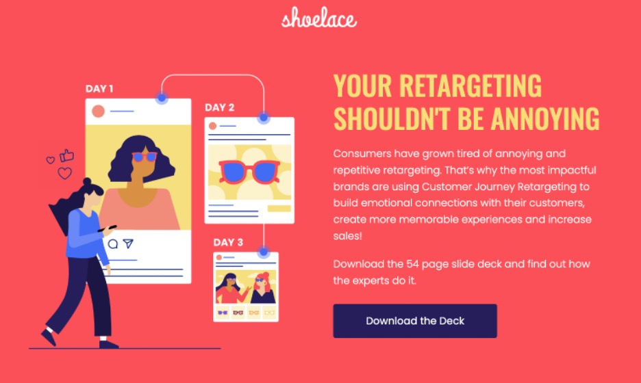
Shoelace’s Customer Journey Retargeting landing page comes with several CTAs, all of which lead to a 54-page slide deck. It’s a great example of making the most of contrasting colors and negative space to make the CTA stand out.
Use strong, action-oriented copy
Keep your CTAs short and sweet.
In other words, stick to no more than five words and ensure you communicate value clearly. Obvious as it may seem, your visitors need you to tell them what you want them to do and what their next step should be.
Phrases that entice prospects to take action include order, sign up, try out, add to cart, get started, subscribe, or register, to name just a few. But it’s a good idea to jazz your CTA up by creating a sense of urgency with time-oriented words such as now, today, or while stocks last.
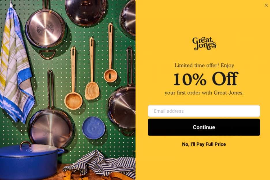
This first-order landing page by Great Jones leverages a very simple black CTA, “Continue,” against a yellow background but adds a twist by including the tongue-in-cheek “No, I’ll Pay Full Price” opt-out link.
2. Get to the Point Immediately
The average attention span has been shrinking over the years due to our constant alternating between different screens, social media channels, and other digital attention stealers. This is why people read only 28% of the words on a web page during an average visit.
So, if you don’t want your carefully crafted copy to be lost on your potential prospects, you should cut to the chase really quickly and set your potential customers in the right direction.
Simply put, declutter your landing page by eliminating all the unnecessary messaging and elaborate contextualization.
But how do you do that and still communicate your value?
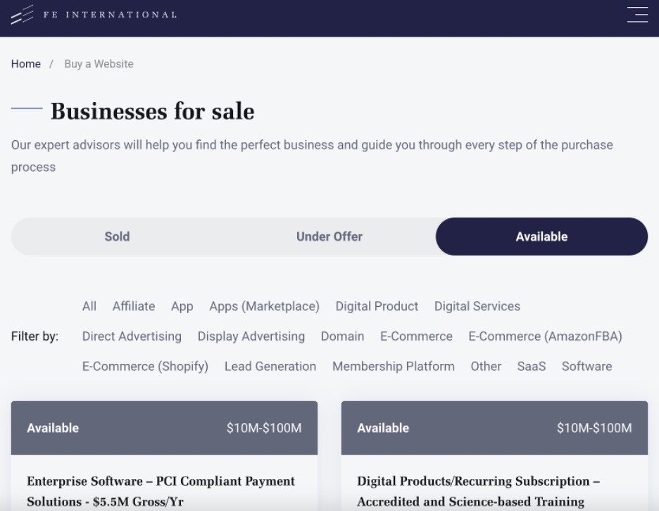
Take a cue from FE International and their Buy a Website landing page. Their core functionality is instantly accessible with literally no contextualization. They could easily have been tempted to cram words, sales pitches, and Google keywords into that page, but they prioritized functionality over everything. And still, their prospects understand what they should do next if they want to purchase a business.
However, if you need to provide some context, you can simply push it below the fold. On their Anagram Solver landing page, UnscrambleX includes additional contextual information, but they choose to place it below the page’s objective. A simple layout prioritizes the tool itself by positioning it at the top of the page within a blue textbox. Such a UX-friendly solution elegantly combats the potential issue of distracting the visitor.
3. Highlight Customer Benefits
Yes, your product or service most likely comes with some amazing features and specs, but your prospects couldn’t care less about that.
They don’t want to read lengthy paragraphs detailing all the flashy functionalities you have built. “What’s in it for me?” is the first thing on their mind while they’re exploring your landing page. The best vehicle for implementing the WIIFM approach is by focusing on the benefits your product or service provides to potential customers.
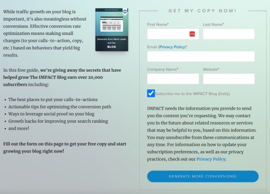
Impact’s landing page for a guide on generating more leads from your blog uses a benefit-driven CTA copy that clearly states why prospects should download it. A simple form is another reason why this landing page works. People aren’t exactly too enthusiastic about filling out countless fields. In this case, it’s obvious that the entire form will take no more than a minute, meaning that even the most impatient prospects won’t be reluctant to type and provide their information.
4. Consider Readability
Sometimes landing pages require lengthy copy packed with information that is essential for the visitor.
In that case, it’s vital to make the content as readable as possible to avoid overwhelming potential customers and confusing them with walls of text. To eliminate this risk, use the following strategies that will improve readability and make your landing page copy easy on the eyes.
Chunking
This practice refers to breaking down your copy into smaller, bite-sized chunks of text that are easy to follow and understand. Instead of presenting your visitors with an avalanche of content that will scare them off your landing page, use this tactic to split it into shorter sentences and paragraphs with negative space between them.
Chunking allows you to emphasize key points and keep a logical flow of information.
Enable skimming
We’ve already mentioned the problem of a short average attention span and distractibility. In other words, many people tend to skim content, that is, quickly go through it in search of the most important points and general ideas.
The best way to cater to skimmers and their approach to reading is to organize your main ideas into several sections and provide a clickable overview of your copy early on. This will allow prospects to easily identify the information they’re interested in and move forward.
Including charts and diagrams is another practical trick since it makes visualizing complex concepts or abstract data easier. Plus, comparison charts have the power to nudge indecisive prospects off the fence.
Use subheadings
Subheadings group similar ideas into a single section, thus improving readability.
Try condensing the main benefits of your product or service into subheadings to help visitors grasp the overall message and have a 360-degree view of your offer in a glimpse.
Add visuals
Pages with visual content attract 94% more views than those that contain only text.
Besides splitting large blocks of text and making them manageable, visuals also add value to your landing page’s overall design and aesthetic appeal. Illustrate your product by including high-quality photos or add eye-catching images/charts/graphs to captivate your prospects’ attention and boost engagement.
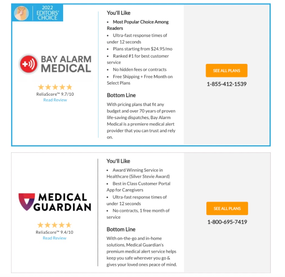
Medical Alert Buyer’s Guide checks all these boxes on their landing page for a guide to the best medical alert systems of 2022. It’s a page with lots of content but excellent readability. The brand achieved this by adding a summary of all the systems they have reviewed above the fold. The copy is organized into logical sections with subheadings, bullet points, short paragraphs, images, and comparison charts to accommodate skimmers and visual learners.
5. Establish Credibility
Consumers want to do business only with the companies they trust.
So, you’d better make sure your landing pages come across as credible and trustworthy, especially since you expect prospects to share their sensitive information with you.
Social proof can do wonders for this purpose and convince your prospects that your business is legit and credible. Here’s how you can implement it on your landing pages.
Reviews and ratings
About 95% of customers read online reviews before making a purchase.
Instead of letting them leave your landing page in search of other customers’ opinions about your company, you should bring these reviews to your landing page. Just make sure these reviews have been either aggregated from third-party review sites and displayed directly on your landing page using a plugin or genuine feedback you get from your customers. Authenticity is essential when it comes to social proof.
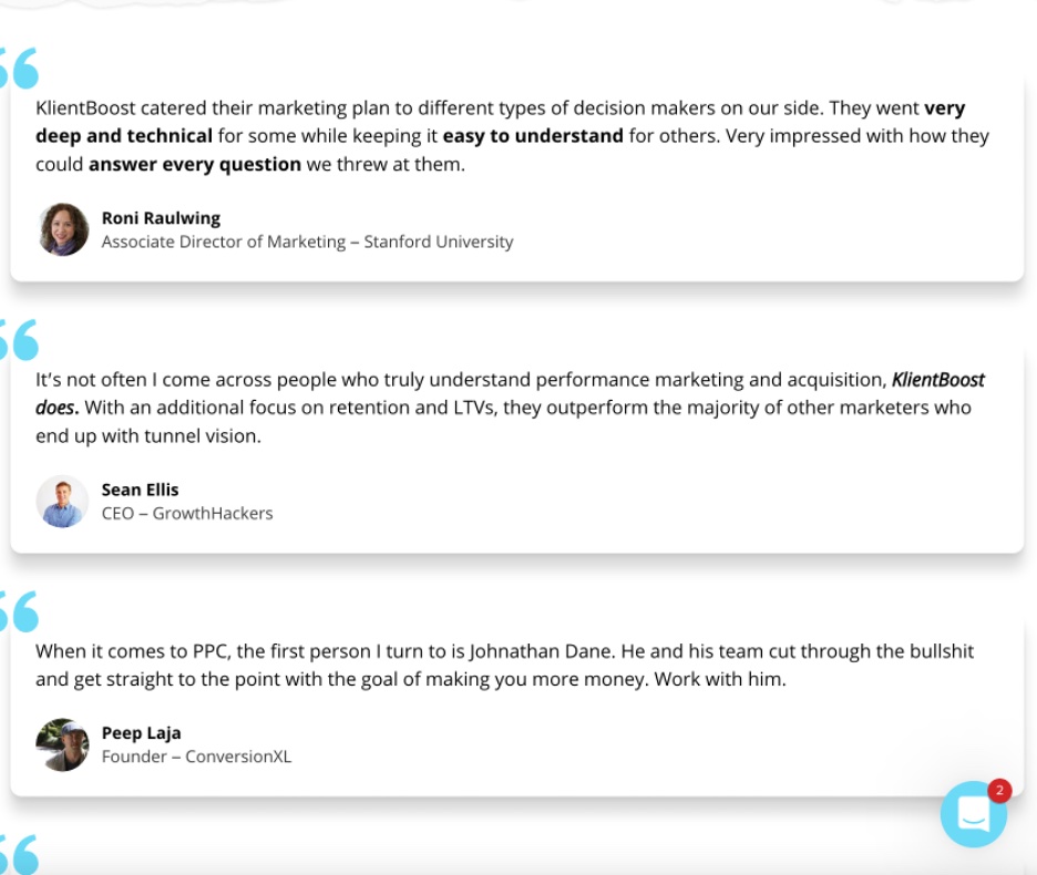
Clientboost shows reviews by reputable industry figures on their marketing plan free trial landing page for an added layer of credibility.
Video testimonials
Social proof is even more credible when your prospects can see and listen to the existing users sharing their experiences with your brand and products.
That’s why video testimonials can get prospects all pumped up about your product or service and boost conversions.
Wyzowl’s testimonial video production page is an amazing resource for effective video testimonials. There’s not just one, but several examples where their clients talk about why they opted for and benefited from the company’s services.
Earned media
When you get a mention in a respectable newspaper, exposure on a popular TV show, or a tweet praising your product or service, it’s free publicity that boosts your company’s reputation. And since you haven’t paid for this type of media, it’s earned and, therefore, organic.
Sharing earned media on your landing page will boost your reputation, which will, in turn, drive conversions.
Instead of praising their own solution, January AI lets notable earned media speak for itself.
6. Embrace Video
Explainer videos are a great engagement and conversion mechanism.
96% of people have watched an explainer video to learn more about a product or service. This format is effective because it demonstrates how a particular solution works within 1-2 minutes. Plus, it saves your visitors from having to visualize complex, intangible, or abstract concepts.
By incorporating an explainer video on your landing page, you can convey your message more quickly and speed up your prospects’ decision-making process.
ClickUp has taken this approach to the next level by populating its entire Discover how ClickUp can work for you landing page with video content. Successfully tackling a topic this broad and complex would have been virtually impossible if the brand had written a conventional blog post.
Presenting this information in video format has a very obvious benefit outside of increased conversions. More accessible information on this topic means that their users are more likely to have a positive experience with the product, enhancing customer lifetime value, a crucial SaaS metric.
Wrapping Up
A well-designed landing page significantly increases your odds of converting the traffic your marketing efforts generate. The trick is to follow the best practices and find the right balance between concise yet engaging copy, attractive visuals, and UX elements. The best practices we discussed can serve as a roadmap you can follow and expand on. But at the end of the day, it’s crucial to keep an eye on the metrics and see what works for you.
Comments