When designing a website or app, most companies focus on making it visually appealing and adding lots of cool, fancy features. That makes perfect sense if we bear in mind that research studies have shown that 94% of first impressions are design-related. In other words, visitors form an opinion about website credibility based on its aesthetic.
But, all this is in vain if your design is not aligned with users’ needs.
So, instead of attractiveness, your main priority during the process of designing a website should be user-centricity.
This concept implies putting users at the center of website design. User-centric design (UCD) is a set of techniques that will allow you to build a highly usable and accessible product, thus providing users with an optimal user experience. As a result, you can expect increased conversion and retention rates, better user engagement, and, ultimately, a boost in your bottom line.
Here are six UCD principles you should implement recommended by Crafted, an NYC web design agency.
Keep the Number of Clicks to a Minimum
You’re probably familiar with the three-click rule.
According to this heuristic assumption, website visitors should be able to find any information they need with no more than three mouse clicks or taps. Even though this unofficial rule has been debunked as a myth, the logic behind it isn’t faulty.
Making information as accessible as possible is an absolute must.
If your navigation isn’t intuitive and users can’t find what they’re looking for within a reasonable time, they will get frustrated and bounce off.
The number of clicks required to perform a certain action should be kept to a minimum. Of course, in some cases, a more complex flow will have to take more steps or clicks to complete, but if we’re talking about some simple tasks, it’s still a good idea to count your clicks.
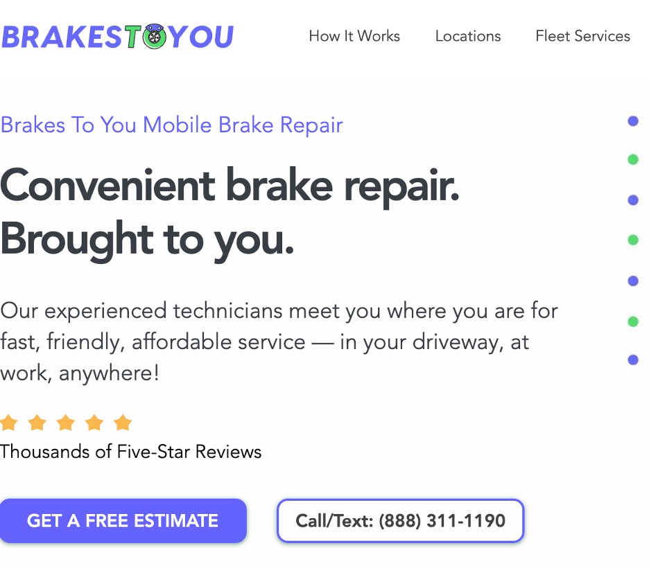
Brakes to You integrated their phone number into the Call/Text CTA. When their visitors land on the homepage, they’re immediately presented with an interactive button with a phone number, and simply clicking on it launches the user’s phone app instantly. This is an excellent example of prioritizing accessibility and helping users find what they’re looking for without having to click back and forth.
Break Down Walls of Text
Creating high-quality content is essential if you want to attract traffic to your website.
But, no matter how educational and informative your content is, website visitors won’t bother reading it if you hit them with walls of text. The same applies to other readability issues such as too small fonts, using many different typefaces, and stuffing your pages with text only.
Go for readable and legible website copy that’s easy on the eyes.
Here are the tactics you should use for this purpose.
Chunking
People don’t want to waste their time wading through columns of text in search of a single piece of information.
Split your content into bite-sized chunks of text that your visitors will easily read.
This approach also allows them to quickly scan your content and find relevant information in no time.
Subheadings
To help your readers navigate your content, divide it into logical sections.
Not only will this tactic organize your ideas better and allow your readers to follow and identify the sections they’re interested in, but it’s also great for SEO. It’s a good idea to include relevant keywords in your subheadings so that both search engines and your website visitors can figure out what a particular section is all about.
White space
Don’t be afraid to leverage white space, as it will give your pages some breathing room.
Besides improving readability, this so-called negative space will also make your important content pop and draw your readers’ attention to it.
Bullet points
Including bullet points will improve the overall readability of your content and highlight important details.
This formatting tactic provides an easy reference to a condensed piece of information so that readers don’t have to read an entire section.
Visuals
The human brain is capable of processing images in less than 13 milliseconds.
In short, we’re hard-wired to process and interpret visuals much better than text.
That’s why you should break up your content with images, charts, infographics, and other visuals to keep your raiders engaged.
Tables
Presenting your content in tables can be particularly convenient if you want to provide them with a summary of your section.
Simply extract key points and place them above the section. This way, skim-readers can quickly consume your content and focus only on what’s relevant to them.
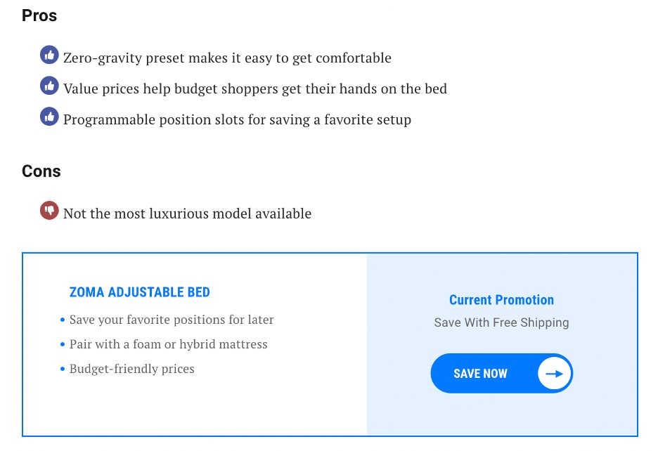
Sleep Junkie covers all the bases on their blog as shown in the best adjustable beds post below. Each product has a “table” section that communicates core information in a very clear and concise way so that the reader doesn’t have to read every word to get the value.
Optimize Your Page for Speed
So, you’ve managed to drive traffic to your website through different marketing activities.
It would be a shame to squander tons of new business opportunities due to having a sluggish website that takes ages to load. Numerous research studies have concluded that every second counts when it comes to this metric.
It’s safe to conclude that people love speed and expect websites to load in a snap.
To stay on the safe side, aim for 3 seconds or less. Otherwise, your conversion rates will start to drop. Plus, don’t forget that loading speed is one of the most critical SEO ranking factors.
Here are some tips for speeding up your website and staying in your visitors’ (and Google’s) good books.
Compress website files
File compression is a low-hanging fruit approach to boosting your website speed.
Use the GZIP technology to reduce the size of your CSS, HTML, and JavaScript files.
However, GZIP compression isn’t the best solution for optimizing image speed. Since this tool doesn’t give you control over the quality of your images after you compress them, it’s best to use Photoshop for this purpose.
Minify resources
Optimizing CSS, HTML, and JavaScript code on your website, that is, removing redundant data such as spaces, characters, unused code, or code comments, will improve your loading speed.
Use tools like UglifyJS or CSSNano, or if you’re on WordPress, one of the platform’s plugins such as WP Rocket.
Use a content distribution network (CDN)
CDNs are servers situated in different geographical locations, where you can store copies of your site.
When visitors try to access your site, they will be delivered content from the server closest to them. This geographical proximity is what makes sure your content will be delivered to your users significantly faster than if you stick to a single, centralized server location.
Reduce the number of redirects
Whenever a visitor is redirected to another page, they will experience a slower loading speed because this initiates an HTTP request and response cycle that has to be completed.
To prevent this “detour,” eliminate all redirects that aren’t absolutely necessary.
Opt for a reliable hosting provider
Choosing a hosting provider isn’t the time to cut corners.
Remember that this is the service on which your loading speed, downtime, and entire website performance depend.
A cheaper solution usually equals poor performance, so don’t pinch pennies when it comes to this.
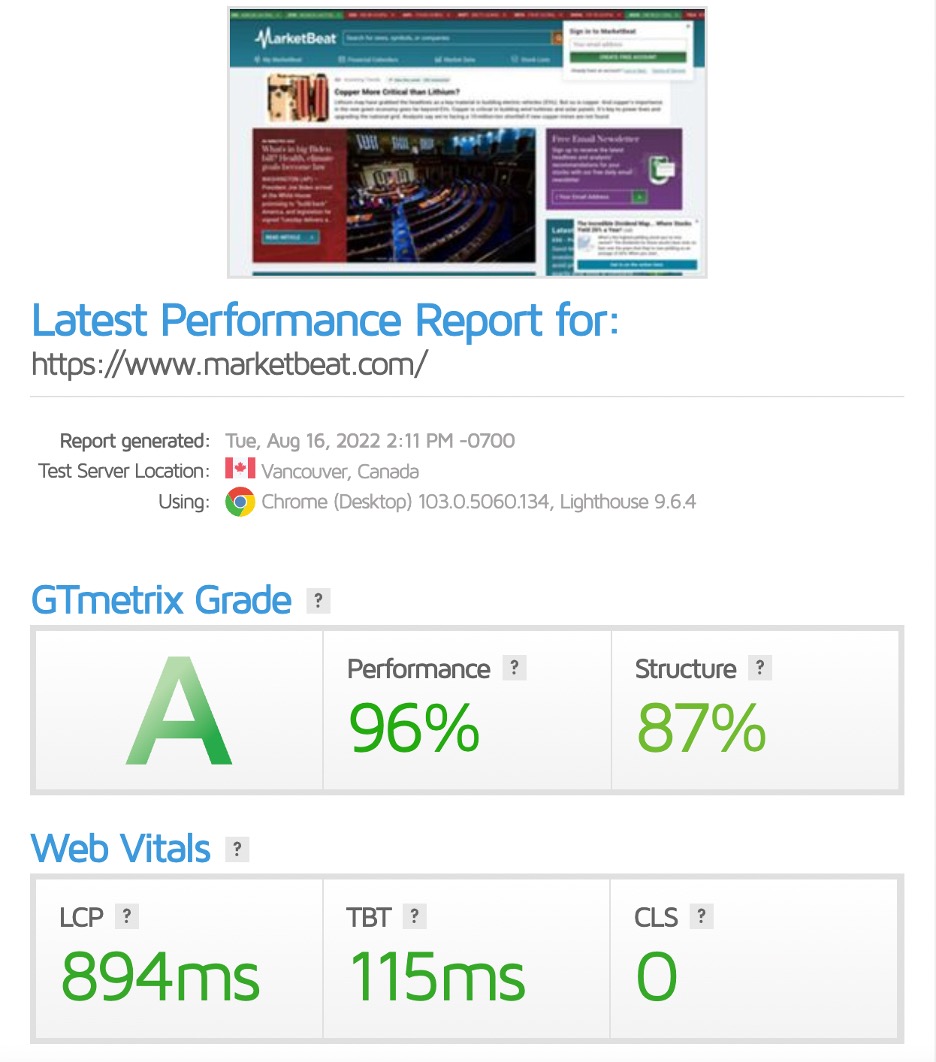
MarketBeat is an excellent example of a well-optimized website that loads quickly. The site scored incredible results on GTmetrix, especially if we consider how content-heavy it is.
Design for Mobile Users
Almost 60% of all website traffic worldwide comes from mobile devices.
This means that a significant portion of your website visitors use their smartphones or tablets to access your website. And if they land on a mobile-unfriendly site, they won’t stick around for much longer.
Simply put, forget about the pinch-and-zoom functionality because it will only make your visitors roll their eyes in disbelief.
Moreover, this will negatively affect their user experience to such an extent that 61% of them aren’t likely to return to your website. In addition, 57% of internet users say they won’t recommend a business with a poorly-designed mobile site.
So, both your traffic and your reputation will suffer if you don’t optimize your website for mobile.
It’s worth mentioning that doing the bare minimum won’t get you very far either.
Don’t slack off and opt for a responsive site which is actually an adapted version of your desktop website. Designing a mobile version of your site or a dedicated app will:
- Improve your website visibility in search results, thanks to mobile-first indexing
- Result in a much better loading speed
- Provide an exceptional user experience since all elements will be designed to fit smaller screens.
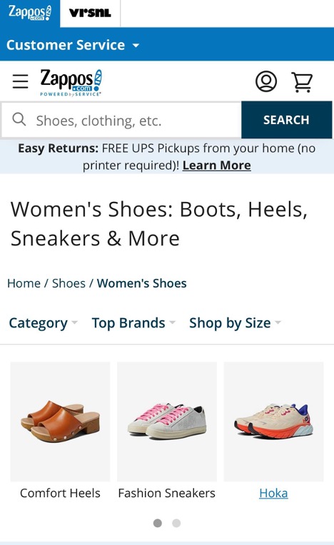
Zappos offers a fully-optimized version of a mobile website. It’s easily searchable, which is of key importance for an online store that carries so many different products. Customers can start their search even before they enter the site — right from the search results page. A search bar is prominently placed at the top and bottom of the page, thus ensuring a seamless user experience.
Be Super Clear About What You Do
Avoid clutter at all costs.
Your visitors should grasp what you do the moment they land on your site. You don’t want them scrolling up and down or clicking around trying to find this out.
Trying to explain what you do using too many words will create redundancy and only confuse them. So, it’s essential to be super clear about the products or services you offer, how potential customers will benefit from doing business with you, and why they should choose you over your competitors.
To achieve this goal, be upfront about your value proposition by carefully crafting it.
Start by identifying your prospects’ main pain point and connecting it with the values your benefits offer.
Digitarial Agency tells people exactly who they are and communicates the benefits of becoming a customer using one sentence and a bullet list. It can’t get any shorter, simpler, and more to the point than this.

Pay Attention to Your CTAs
As you can see, saying more with less is one of the main principles of marketing and user-centric design.
A call to action is a crucial element of UX and UCD. These buttons are catalysts that will prompt already engaged website visitors to take action and convert.
The point of having CTAs across every website page is to tell your audience what you expect them to do next. That action might be subscribing to your newsletter, accepting your offer, registering for a webinar, or making a purchase.
CTAs serve as signposts on your visitors’ customer journey, directing them toward your mutual goal — finding a solution to their pain point and converting.
Without a clear CTA, your audience might be confused about what their next step should be, which can result in their leaving your website without completing the desired action.
Here are some principles for creating customer-centric calls to action.
Visibility
Ensure your CTAs are visible and prominently placed so potential customers can easily see them.
Noticeable CTAs should be situated above the fold so that they’re visible even if your prospects don’t scroll down. It’s a good idea to have several CTAs with the same message across your homepage.
Use a color different from the rest of the page to prevent your CTAs from blending in. Complementary colors will allow your CTA to stand out and attract website visitors’ attention.
As for the size, it’s crucial to find the right balance, as you don’t want a button that’s too large or too small. It’s best to A/B test it and see what your audience prefers.
Actionable wording
Action-oriented messaging is the most effective and compelling.
The first word should be a verb such as Buy, Read, Sign Up, Download, or anything you want them to do.
After that, you can add value by telling your audience how they will benefit from clicking on the CTA button — Buy Now and Get a Discount, Download the Ebook and Learn How to Grow Your Business, or Sign Up for Your Free Month.
A single offer per page
While it’s perfectly OK, and even desirable, to have more than one CTA on a single page, it’s worth mentioning that all of them should convey the same message and lead to the same landing page.
Placing different calls to action across a single page will leave your visitors wondering which of the two or more buttons they should click.
Grammarly provides a great example of a powerful CTA with a clear benefit for those who decide to take action.
Wrap Up
With user-centric design, the needs and preferences of website users come first. It’s not about building a website and then incorporating user-friendly elements and features — it’s the other way around. The first step of your website development process should be understanding users and identifying their requirements. Only after that can you start focusing on the actual design with this information in mind. Implement these six UCD principles when building your website to improve its usability and user experience.
Comments