Your web design can make or break your e-commerce store.
Designed your store the right way, and it can help you set a good first impression on your website visitors, build trust with your potential customers, and lets you stand out from competitors.
In short, you’d be in a very good position to close more sales.
However, creating a high-converting eCommerce website can be challenging as it involves more than just the visual elements.
There are still some web design mistakes that are leading your e-commerce website to have higher bounce rates and lower your conversions. However, using the best website builder for e-commerce can make things easier.
In this post, let me share the web design mistakes that can ruin your e-commerce store, and how you can avoid doing them.
1. Using Low-Quality Product Images
Big food companies put a lot of effort into their product images because these photos can invoke the kind of emotions that can compel your target audience into buying.
For instance, imagine a hot summer day, and you see a picture of a soft drink with clear water beads on the side of its bottle that you can almost “feel” its coolness.
Doesn’t that image make you want to run to the nearest store and buy that cold soft drink?
That’s how compelling product images can be.
However, using low-quality images will only put off your potential customers because they either can’t see your product, or they’re unsure of the quality of your products (among other things).
Low-quality images that are pixelated, blurry, too dark or too bright, too close or too far that you can’t even see the name of the product, can only lead to truckloads of sales opportunities down the drain.
This makes it crucial for you to invest in high-quality product images.
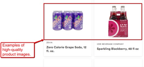
You can hire professional photographers or if you’re taking the product photos yourself, at least ensure that your images are clear, well-lit, and not taken in weird angles, or have strange backgrounds.

Image Source: Wholefoods
If you can, take photos from different angles to show your potential customers different views of your products.
The bottom line is, use product photos that look good enough to convince your eCommerce website visitors to buy and not run in the other direction.
2. Overwhelming Website Navigation
Each of your web pages should be designed for a primary objective, and your navigation should make it simple or easy for your site visitors to go from one point to the next.
Overwhelming your e-commerce store visitors with too many headers and buttons in your navigation menu can obscure your main call-to-action.
It’s vital that you keep the path to your CTA button simple and clear because web elements that you add like your graphics and widgets might only distract your site visitors.
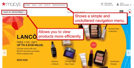
For example, on the Macy’s.com website, they used a different font style and size for their “Shop by Department” button, making it stand out from the main navigation menu.

It’s a great strategy to draw your site visitor’s attention and offering them easier access to your products, which will ultimately lead them to your “Buy Now” button.
A simple and clear navigation menu can improve your website’s usability plus offer a better user experience, which helps lower your bounce rates and increase your conversions.
Also, your e-commerce website’s usability touches on other aspects of your business, such as establishing a good UI/UX design to help make your website less outdated and an eCommerce SEO campaign successful.
3. Not Offering An Onsite Search Option
The two common primary goals of your potential customer visiting your e-commerce site are one: find solutions to their problems through your products, and two: find them as quickly as possible.
Now if your e-commerce store fails to make this happen for your website visitors, they might leave immediately and look for other sites that do offer product search options.
This can lead to higher bounce rates and lower conversions.
You can argue that this would depend on the number of products you have and it’s true that you might not need this if you sell a total of twenty products at most.
However, having a product search option can only make the search process on your e-commerce store quicker for your potential customers, and offer them a better user experience.
After all, it can’t hurt to make things even faster for your site visitors to get to your products and buy them, right?
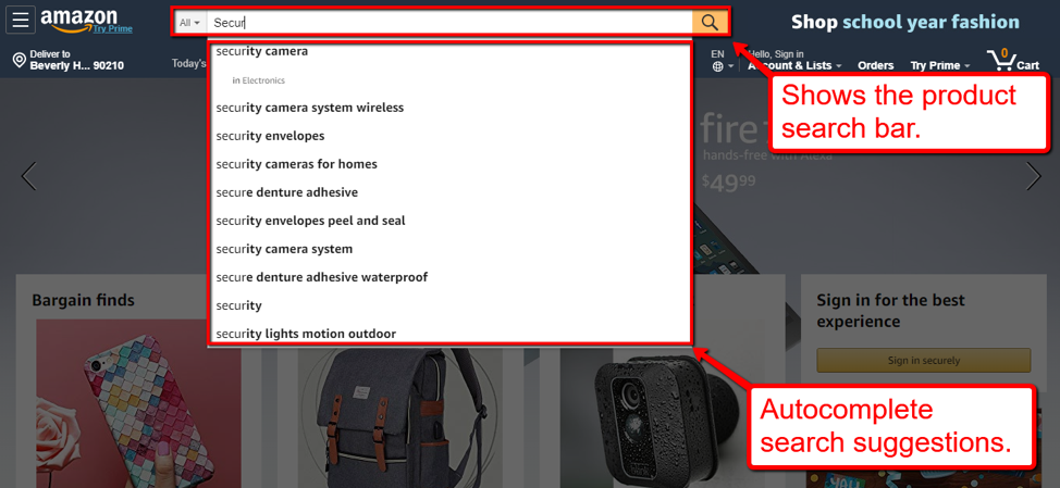
Ecommerce businesses that sell thousands of products like Amazon offer a product search option for its users.

Amazon’s autocomplete feature also gives related keywords or products suggestions that help users find what they’re looking for faster and easier.
An autocomplete feature can also be an excellent way to subtly market your related products that your potential customers didn’t think of buying before landing on your e-commerce site.
You can think of it as a two-in-one tool that helps users find what they need while you’re promoting other products at the same time.
Pretty cool, right?
Now that you know how useful an onsite product search option can be, you can do away with thinking that you don’t need one.
4. Poorly Designed Logo
If you’re one of the people who think your logo plays only a small part in your e-commerce store, then you couldn’t be more wrong.
Your logo is one aspect of your web design that presents your identity and your brand.
Some of the biggest brands have made little changes to their logos over the years because it’s what their customers identify them with.
It can even be the first thing your potential customers see when they’re new to your brand.
This makes it crucial for you to invest in a well-designed logo that effectively embodies your brand and leaves a great, if not, a lasting impression on your target audience.
You have the option to create your logos with online logo generators, but, let’s face it, if you want to come up with a logo that uses the art and science behind color schemes, shapes, plus symbols to be used effectively for your e-commerce business, you’ll need some help.
That’s where third-party graphic design companies can help you. The logo Designs at LogoMyWay, for example, are very professional-looking. By tapping platforms like LogoMyWay, you can get professional designers to create stunning logos for your e-commerce store.
Final Thoughts
Are you guilty of making these web design mistakes that can ruin your e-commerce store?
If you answered no to that question, then good for you, but if you answered yes, then reading this post can be your first step in making a few changes in your web design.
By learning these mistakes, you’ll get insights on what to tweak to help improve your e-commerce site’s performance and ultimately increase your sales.
Craig Murphy of web design agency – ALT Agency reiterates that a poor or overwhelming website navigation is one of the biggest reasons for a high bounce and suggest that by removing links that aren’t necessary to your core website goal and removing anything distracting will help with navigation. Another thing that is a common web design mistake is having a slow loading website. With tracking software, analytics software, tracking pixels, live chats and review widgets its very easy to see why websites can start to load slowly. The advice is to aim to have a website that loads in 3 seconds or less by reducing the number of connections and items your website has to connect to and download.
If you found this information useful, please share this with your network. Cheers!


Comments (4)
What a great insight on web design..I love it
These are thoughtful.posy
Another important aspect is search engine optimization. If i have made a website, but nobody can efficiently search it then my business will be impacted.
Graphics and Web designing is very crucial, i have been on website that i questioned myself what am i really doing here? Even, if what they offer is genuine, i would’t want to stay any minute on that website because the graphics was poor, no fluent communication with the data on it and my reasoning, fake images, blurry images, many things just go wrong when there is a low budget graphics and web designing in place. I tried learning Graphics designing sometime ago on my own and discovered how deep it was, it is in itself a career, you are either in or out. Thank you for this article, i am sure that it serves as a warning to flaws in the web design and valuable information to all graphic designers.