


Think about the last time you bought something online that mattered. Not a cheap replacement cable, but a calculated purchase, like software for your team, an expensive machine, or a high-end service. You probably didn’t immediately click “buy” but spent time gathering information, weighing options, and looking for reasons to trust (or to doubt).
Your website is where that internal dialogue happens for your potential customers. Right now, they’re having that conversation on your pages.
The difference between a site that simply exists and one that actively sells lies in how it handles that moment. Friction is the cumulative effect of small uncertainties. A vague headline, a missing detail on a pricing page, or a contact form that feels like a black hole. Each one is a silent obstacle.
Addressing these hidden hesitations is the most powerful lever for growth. Successful businesses see conversion lifts of 400% or more when making intentional, user-first design choices.
Let’s talk about the specific UX choices that can get you there.
Streamlined, Intuitive Navigation and Search
Navigation and search remove friction caused by uncertainty.
When visitors can’t tell where to go next, they pause, scan, and second-guess. That hesitation often ends the session. Clear paths reduce that mental effort and help buyers move forward with confidence.
Many visitors arrive with a specific goal. Some want a product category. Others want one exact item. A sales-ready website supports both behaviors without forcing people into a single path.
Primary navigation should reflect how buyers think, not how teams organize internally. Category labels need to match the user’s language. Search needs to work fast and return relevant results without extra steps.
To achieve this on your website:
- Keep navigation shallow. Avoid burying key categories behind multiple clicks.
- Use clear labels and limit choices at each level.
- For search, place it where users expect it and make it responsive.
- Predictive search reduces friction by showing results as people type.
- Filters should help narrow results quickly, not overwhelm users with options.
- Each result should show enough detail to support a decision without forcing a click.
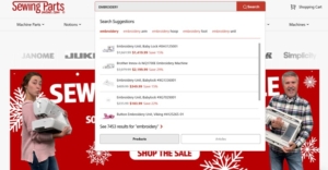
Sewing Parts Online is a brand that shows how this works in practice. They sell sewing machines, replacement parts, and supplies, often to customers who already know what they need.
Their audience doesn’t browse for inspiration. They want speed and accuracy. The site uses an AI-powered search tool that predicts matches the moment users start typing. Results appear instantly, without sending users to a separate search page.
This approach removes friction tied to loading delays and extra navigation steps. It also reduces errors by surfacing relevant parts early. That provides a smoother path from intent to purchase.
Source: sewingpartsonline.com
Transparent Pricing
Pricing removes friction tied to doubt and anxiety. When visitors can’t tell what something costs, they hesitate. They scan for clues, scroll for answers, or leave to compare options elsewhere. Clear pricing keeps people grounded and reduces the mental work needed to move forward.
Showing pricing in multiple places on a landing page reinforces trust. It tells buyers they won’t face surprises later. It also supports different reading behaviors. Some users look for numbers right away. Others need context before they care about cost. When pricing stays visible and easy to understand, both groups stay engaged.
Teams that make pricing obvious and intuitive often see conversion rates increase by as much as 50% because buyers feel informed early.
To achieve this on your website:
- Avoid hiding prices behind forms or vague ranges with no explanation.
- Place high-level pricing near the top of the page so users can quickly assess fit.
- Reinforce it again near key decision points like feature sections or testimonials.
- Break down what’s included using plain language.
- Keep formats consistent so people don’t have to re-interpret numbers each time.
- If pricing varies, explain why and show how users can get accurate details fast.
An example of this is CodaPet, a company providing in-home euthanasia services for pets. Pricing varies by location, so they create landing pages for each city they serve.
On the Denver landing page, users see an overall price range directly in the header. That same area includes a short form to request a personalized quote. Further down the page, CodaPet breaks out individual service items and their costs.
This structure reduces stress tied to uncertainty and helps families understand their options without extra steps.

Source: codapet.com
Industry-Related Social Proof
Social proof removes friction tied to trust. Buyers hesitate when they can’t tell if a brand is credible or relevant to their needs. Authority signals answer those doubts quickly. They show that others have chosen the brand and felt confident doing so.
Industry-related social proof works best because it feels familiar. When buyers see people they recognize or relate to using a product, the brand feels safer. Visual proof matters here.
About 85% of consumers say they prefer visual user-generated content over branded content when deciding what to buy. Photos and videos reduce skepticism faster than written claims because they feel direct and unfiltered.
To achieve this on your website:
- Choose proof that matches your audience and category. Generic reviews won’t help much.
- Focus on signals that reflect how and why people use your product.
- Place social proof early on key pages so visitors see it before doubt sets in.
- Use clear captions that explain who’s featured and why they matter.
- Keep visuals current and avoid over-polished assets that feel staged.
- One strong, relevant example beats a wall of logos with no context.
Icecartel applies this approach with precision. They sell men’s moissanite jewelry, a niche where style, status, and legitimacy matter. On their homepage, they feature a carousel showing well-known celebrities wearing their pieces. This immediately connects the brand to public figures that their audience recognizes.
Below that, they include a video where a celebrity walks through a behind-the-scenes tour of their shop and factory. This adds depth and transparency.
The content reinforces quality, scale, and real-world presence. By anchoring their brand image in visible, industry-aligned proof, Icecartel reduces trust friction and helps visitors feel confident about buying high-value jewelry online.
Streamlined Information Design
Information design removes friction caused by mental overload. When pages feel dense or disorganized, visitors work harder to understand what’s being offered. That effort drains focus and slows decisions.
Clear structure helps buyers absorb information without strain and keeps them moving forward.
Straightforward copy, whitespace, and scannable layouts reduce cognitive load by making priorities obvious. Visitors can quickly tell what matters, what to read next, and what action to take. Collapsible FAQs help by keeping secondary details available without forcing everyone to read them.
This approach supports different intent levels while keeping pages calm and readable.
To achieve this on your website:
- Write in plain language and trim anything that doesn’t support a decision.
- Short paragraphs and clear headings help users scan before they commit to reading.
- Use whitespace to separate ideas and prevent sections from blending together.
- Design layouts with a clear visual hierarchy so one element leads naturally to the next.
- Place FAQs near decision points and keep answers focused.
- Avoid long blocks of text and competing calls to action that pull attention in multiple directions.
Custom Sock Lab shows how effective this can be. They design and produce custom socks for companies, events, and individual buyers. Their site uses a simple, spacious layout that gives each section a clear role.
Content sits within defined areas, making it easy to understand what each section covers. Copy stays direct and avoids unnecessary detail. Nothing competes for attention, which keeps the focus on products and options. The experience feels organized and intentional.
That sense of order reduces friction, supports trust, and helps visitors stay confident as they move closer to placing an order.
Mobile-Optimized User Experiences
Mobile optimization removes friction caused by cramped layouts and hard-to-use interfaces. When pages feel awkward on smaller screens, users lose patience quickly.
Over 80% of internet users now own a smartphone, which means many buying decisions start or happen entirely on mobile. A poor mobile experience creates immediate resistance, even if the product itself is strong.
A mobile-optimized experience supports clarity, accuracy, and comfort. Buttons feel easy to tap. Text stays readable without zooming. Content flows in a clear order that matches how people scroll. When mobile UX works, users focus on the task instead of fighting the interface.
To achieve this on your website:
- Design for mobile first rather than shrinking a desktop layout. Increase spacing around interactive elements so that taps feel intentional and error-free. Keep forms short and break longer processes into steps. Use clear visual separation between sections to avoid blending content together. Prioritize the most important actions and remove anything that distracts from them. Test layouts on real devices to catch issues that mockups often miss.
Veed provides a strong example. They offer an AI-powered video editing platform, where precision and usability on small screens are key.
Their mobile experience uses generous spacing around controls, making it easier to tap buttons and adjust settings without mistakes. This matters for video editing, where accidental inputs can disrupt progress.
Content sections stay visually distinct, helping users understand features without feeling overwhelmed.
By resisting the urge to pack features too tightly, Veed delivers a polished mobile experience. That care signals technical confidence and reduces friction for users who expect professional tools to work smoothly anywhere.
Fast, Reliable Page Performance
Slow load times interrupt intent and break focus. This causes users to question reliability and often leave before content even appears.
Speed supports confidence by signaling that a site works as expected and respects the user’s time. Fast performance keeps momentum intact. Pages load smoothly, interactions respond instantly, and transitions feel stable.
That reliability matters during high-intent moments like pricing reviews, form completion, and checkout. Performance issues at these stages create doubt and increase abandonment. Consistent speed helps users stay focused on decisions rather than technical distractions.
To improve performance:
- Start with measurement. Track load times across devices and connection types, not just on fast desktops.
- Optimize images by compressing files and serving the right sizes for each screen.
- Minify CSS and JavaScript to reduce unnecessary weight.
- Use lazy loading for offscreen content so critical elements appear first.
- Limit third-party scripts and remove tools that don’t provide clear value.
- Choose hosting and infrastructure that can handle traffic spikes without degrading response times.
- Caching strategies also help repeat visitors load pages faster.
Several trusted resources can help teams move from awareness to action:
- PageSpeed Insights provides clear diagnostics and prioritized recommendations.
- Lighthouse offers deeper audits for performance, accessibility, and best practices.
- WebPageTest helps analyze real-world loading behavior across locations and devices.
- GTmetrix combines performance scores with actionable reports that highlight bottlenecks.
- For ongoing monitoring, tools like SpeedCurve and Calibre track performance trends over time and flag regressions early.
Used together, these resources support faster, more reliable experiences that reduce friction and keep buyers engaged.
Final Thoughts
Sales-ready websites succeed because they reduce effort at every step.
Clear navigation removes guesswork. Visible pricing reduces anxiety. Relevant social proof builds trust. Structured content lowers mental strain. Mobile-friendly design supports accuracy. Fast performance keeps momentum intact.
None of these choices feels dramatic on its own. Together, they shape an experience that respects how people think, browse, and decide.
Buyer friction rarely comes from one big flaw. It builds from small obstacles left unchecked. Smart UX removes those obstacles early, allowing interest to turn into action without pressure. That’s how websites start supporting sales instead of quietly getting in the way.


Comments