
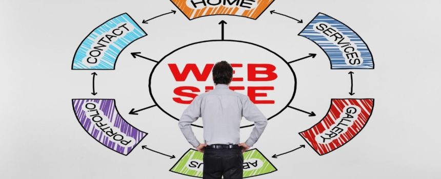
How much thought did your designers give the colors on your website?
Did they use a color scheme because it’s fashionable? Maybe they were briefed to choose colors that represent your company’s corporate identity?
Or did they apply no logic whatsoever and simply use whatever colors “felt right?”
What many site owners and web designers don’t realize is that color plays a far more important role in conversion than simply presenting the visitor with a pleasing interface.
What is Color Psychology?
Color psychology is the study of how human beings’ emotions and behaviors can be manipulated through the use of color. And even though this may sound to the skeptical reader like pseudo-science, I can assure you there’s plenty of research to back it up.
Fact is, by using specific color schemes on your site, you can make visitors feel emotions that will make them more comfortable with becoming a customer. These emotions ease their concerns about doing business with you.
In this article, we’ll take a look at the emotions that certain colors are associated with and look at examples of websites that have used these to their advantage.
Blue and Green – Credible & Eco-friendly
Ecopreneurist is an energy savings company that thrives on two things: being more credible than competing energy suppliers and their reputation for being environmentally conscious.
Using the right imagery and text on their website goes a long way towards communicating these two concepts to their site visitors, but the site designers didn’t stop there.
As you’ll notice on their energy comparison page, there are only two dominant colors being used: blue and green.
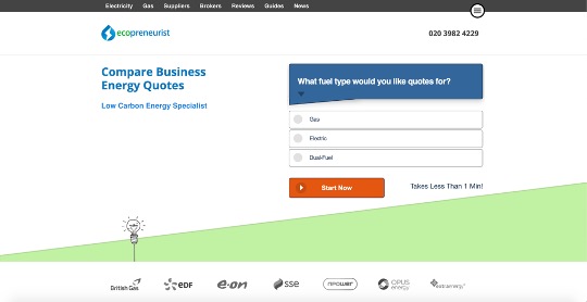
Green is a relatively obvious choice for a company that has an ecological focus. While it’s without a doubt the color that’s most often associated with nature, you can’t really call “nature” an emotion, can you?
Green causes feelings of tranquility and harmony. It’s also known to make people feel safe and optimistic.
When you’re a business owner browsing the web for an alternative, cheaper supplier of energy, it’s possible that you may be in a highly focused, even anxious state of mind. Thinking about your business expenses and doing online price comparisons isn’t the most relaxing thing in the world.
By using green, Ecopreneurist is applying color psychology to combat feelings of agitation and stress that their leads may be experiencing.
The second color used on the Ecopreneurist page is blue.
Blue is a color that’s associated with feelings of reliability and security. It’s considered a traditional, even conservative color. It’s perfect for a company that wants to flaunt its credibility and integrity.
By using blue, Ecopreneurist is establishing their brand as one that business owners can trust with one of their most important expenses – energy.
Red – Capture Attention & Trigger Action
Not all colors need to say something about the website’s brand. Some can be used purely to generate an emotion that triggers action. When used correctly, red is the perfect color for this purpose.
Red is typically not used as a foundational color for a site, given that the emotions it evokes can be quite intense. People associate red with risk and urgency – feelings that could alienate visitors.
Red is often used quite sparingly on websites that want to trigger conversion. It’s placed in places to grab the attention of visitors and create a sense of urgency. It elicits the feeling that they need to take action or they might miss out on a great deal.
This is what makes red a perfect color for conversion-focused pages like you can see in this Newsweek mattress reviews post. The publisher wants to keep the reader’s attention on the long sections of text and also drive home the fact that visitors need to take action by clicking on one of the items.
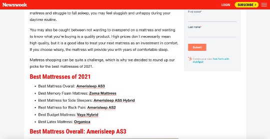
The majority of the page is made up of white space. Despite being used so subtly, red is comfortably the most prominent color. This is a very smart play by Newsweek. Visitors have a relatively neutral emotional experience while browsing this page until a flash of red grabs their attention and urges them to take action.
Black – Prestige & Sophistication
Luxury brands often choose black because it’s the color most often associated with prestige, elegance, and sophistication.
Brands that have an aspirational edge to them often use black as the dominant hue on their websites because they want visitors to feel like owning one of their products will boost their self-esteem.
Countless brands that trade on their high-end image and want to create a sense of opulence use an extremely simple color scheme of white and black. Take a look at Rolex, YSL, Christian Dior, and Chanel.
Omega really drives home its reputation as a purveyor of world-class opulence. The brand’s website is a study in simplistic elegance.
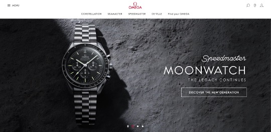
Despite the company’s famous logo being red, you won’t find the color anywhere, the designers choosing to use black on a plain white background throughout the site.
Some Final Thoughts
If you’re starting to set up your company’s website, or if you’re looking to redesign, think long and hard about the emotions you want your visitors to feel as they’re browsing. You may also want to choose from this list of web design agencies and have professionals guide you through the process.
This isn’t a choice that should be made hastily. Think about the feeling that you’re selling. What abstract things are associated with your product or service? Safety? Elegance? Value? Responsibility? Ethics?
Whether you’re going to do it consciously or not, these abstracts will be associated with your products through the text you use, the imagery on your site, as well as its color scheme.
The emotions you want to associate with your brand are the emotions that will boost conversion. And this is something you can control.
Don’t let the feelings your site evokes be accidental. Take color psychology seriously and make conscious design decisions that will boost your conversion rates.


Comments