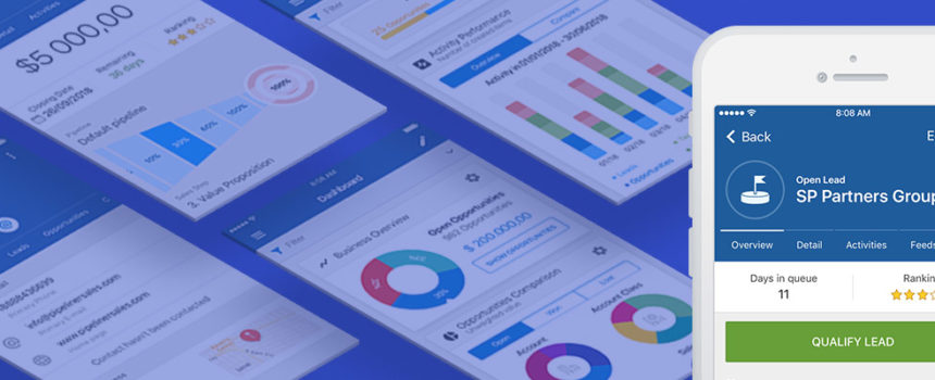
There are many important components that go to make up a worthwhile mobile app. But the most important component is…(drum roll please)…the user interface, known to most everyone today as the UI.
Very obviously, with a mobile app, you’re quite limited as to viewable screen space. A potential user will glance at it, and if they don’t immediately get an idea of how it works, they’re gone. Mobile users are quite impatient, and won’t engage if they don’t get it pretty close to right away.
The Laptop or Desktop Difference
On a laptop or desktop computer, it’s a little different. A user might persist a bit, access online documentation or help, or engage in a live chat with the vendor company. There is also technology with which the user can be onboarded step-by-step.
Beyond that, the laptop or desktop experience can be triggered, optimized, and fine-tuned down to even the type of user. For a CRM, that could be a sales manager, an administrator, or a salesperson. At Pipeliner, we’re utilizing 4 different technologies today, right in the application, to help the user along. We have a chat window, a knowledge base, an onboarding technology, and a support ticketing system.
On mobile, however, such flexibility isn’t possible. A potential user either understands it, or they don’t. Even one too many clicks could lead a user astray, and they would be lost. Help and support on mobile is limited—you can’t do a lot in such a small space.
UI Focus on the User
UI design, from my experience, isn’t a matter of trend. In most cases, “trend is not your friend.” Who sets a trend? It should never be a designer following along the lines of “what is cool right now.” The UI should be designed completely around the user and their experience, and their ease of use.
I’ve actually learned a lot from games. Games provide a very good overview of how users onboard and interact. I’ve been paying very close attention to the online game Fortnite, one of the most successful games in history with over 250 million users. My son and everyone in his class are playing it. The target age group for this game is 9 to 14, and it’s amazing to watch how fast these kids are learning and interacting. They’re not reading the documentation! They’re just jumping right in. The game is understood without a second thought.
Of course, a game must also be challenging. While a business app should be just as easy to use as a game, the “challenging” aspect cannot be part of it. The user of a business app isn’t earning extra points by finding the hidden treasure or the secret weapon, so all functionality must be geared to ease of use.
Visual and Universal
A UI should be totally visual because mobile itself is a visual tool. At Pipeliner, we’ve simply extended the design philosophy of our desktop version—dynamic instant visualization—to our mobile CRM. It is completely visual.
When it comes to symbology, our UI is designed in a way we know our user community will understand. There are many icons that are universal. For example, everyone understands that a star means “favorite.” A plus sign (+) means adding something. A magnifying glass means “search.” A gear sign indicates setup.
It’s a similar scenario to icons seen on road signs—they’re the same the world over so that drivers in any country will understand them. The same is true with icons in airports. With over 50,000 airports in the world today, and travelers from everywhere, can you imagine what would happen if each airport decided to create their own icon for, as an example, baggage claim? Chaos would result.
This kind of uniformity is even more important on mobile because mobile has even more users than automobiles or airlines. A majority of people in the civilized regions of planet Earth have mobile phones. If you don’t have one, people regard you very oddly—you’re living on the moon.
Apps should have a universal navigation system, even when colors, backgrounds, and languages are different. An example is calendar apps—while there are different companies making calendars, they look pretty much the same. Otherwise, how could someone use them and update them? People also want to know when holidays and special days are. These are different for every country, but the symbology is the same.
Business Differentiation
While you should implement universal icons and instantly understood symbology, you must also integrate your own corporate look and feel into the design. We have done that at Pipeliner, and it requires a little bit of magic that every company has to utilize. If you don’t do that, you’re not separating yourself out from competitors.
You have to strike right in between being completely unique—having your own look—and being completely universal. There’s a sweet spot in there so that you maintain your own look and feel but make it possible for any user to come along and engage with your app.
Simplicity
Overall, the key that I always keep in mind as regards a UI is simplicity. This concept was communicated beautifully by Steve Jobs: “Simple can be harder than complex. You have to work hard to get your thinking clean to make it simple. But it’s worth it in the end because once you get there, you can move mountains.”


Comments